- FMCG
- Kazakhstan
- 2024
“Novyi Den” branding: a visual identity for a dairy brand inspired by Kostanay
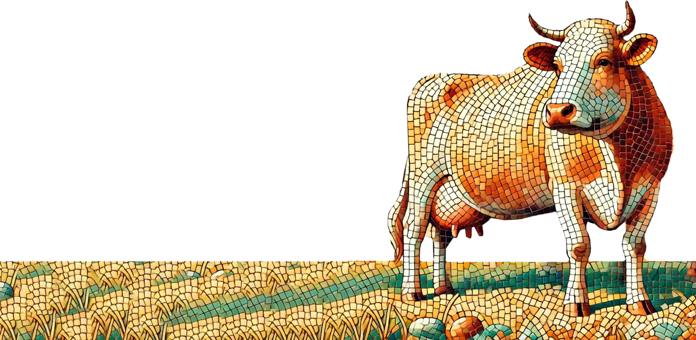
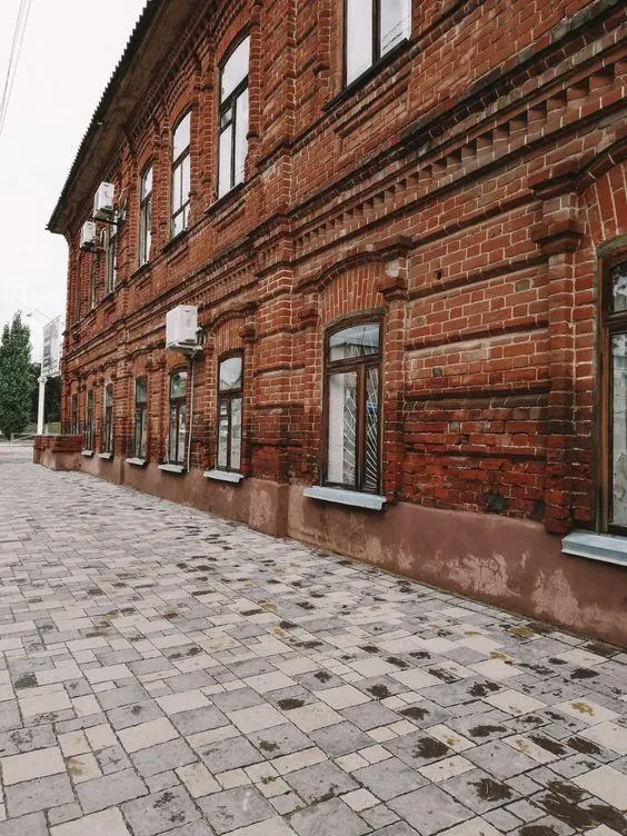
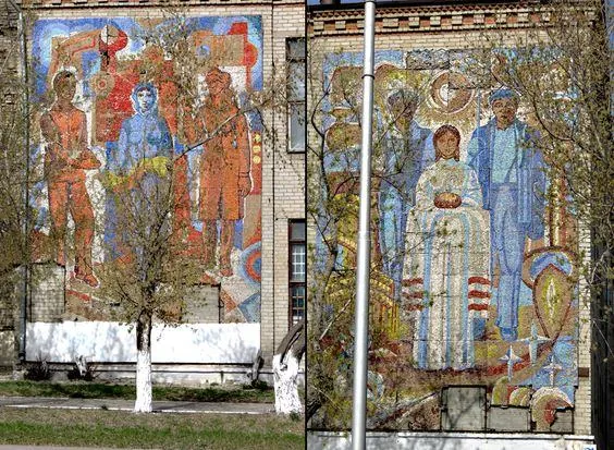
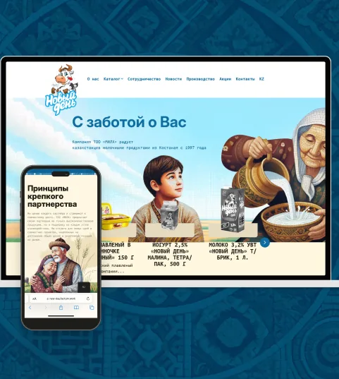
The Kostanay dairy brand “Novyi Den” (“New Day”) was entering the Almaty and Astana markets. We created a visual identity for it that conveys the character of its home city, with red-brick houses and mosaics on the façades, and speaks to the three heroines of its audience.
Starting point
The Kostanay brand was preparing to enter the Almaty and Astana markets, where it was almost unknown. It needed a visual language that would set the product apart from familiar dairy brands and keep its link to the region.
What we learned about the audience
The audience portrait came out of our analysis: we identified three heroines who differ in age, district, language and content habits.
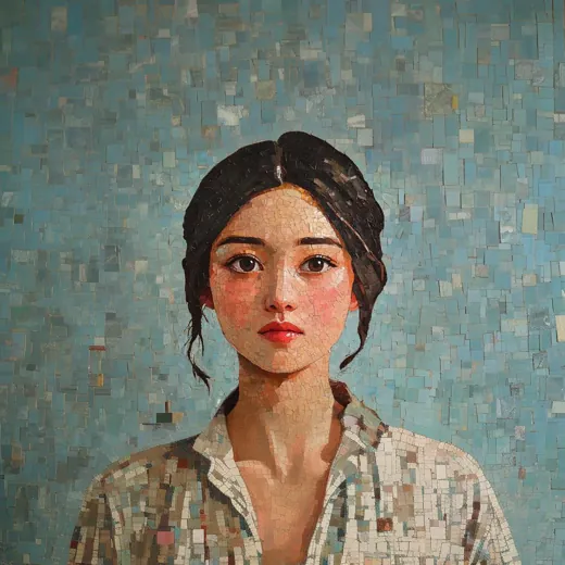 Homemaker25+lower and central AlmatyKazakh 70%, Russian 30%local bloggers, entertainment content, Reels, Instagram about family
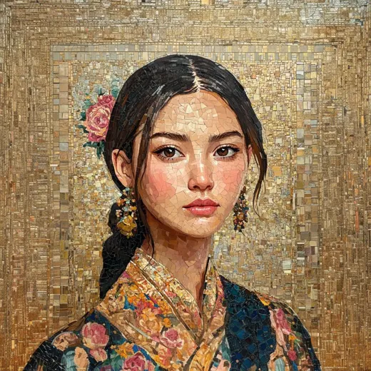 Affluent homemaker25–40upper AlmatyKazakh 50%, Russian 50%international and local aesthetic bloggers, TikTok, Pinterest
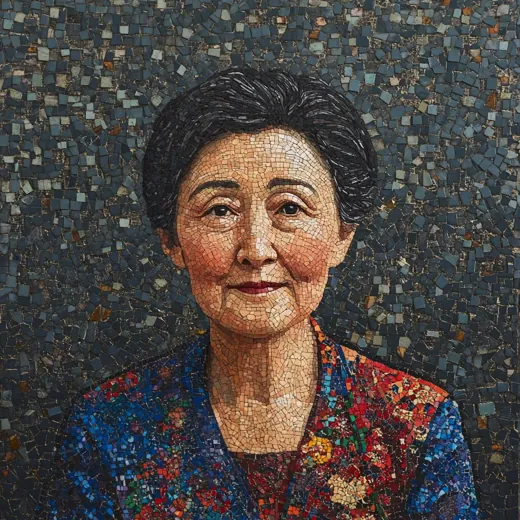 Pensioner55+lower and central AlmatyKazakh 70%, Russian 30%recipes, print media, television
Task
Create a visual identity that conveys the character of Kostanay and the naturalness of the product without literal historical imagery, while remaining recognisable to people in Almaty and Astana.
Idea
We found the idea for the visual identity in Kostanay itself, where the brand comes from. We needed to convey the character of the region and the product, milk, without literal historical images of people and buildings, yet in a way people would recognise.
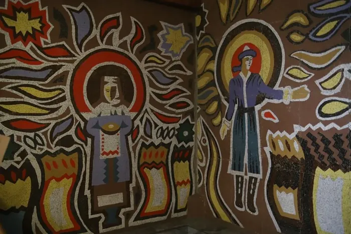
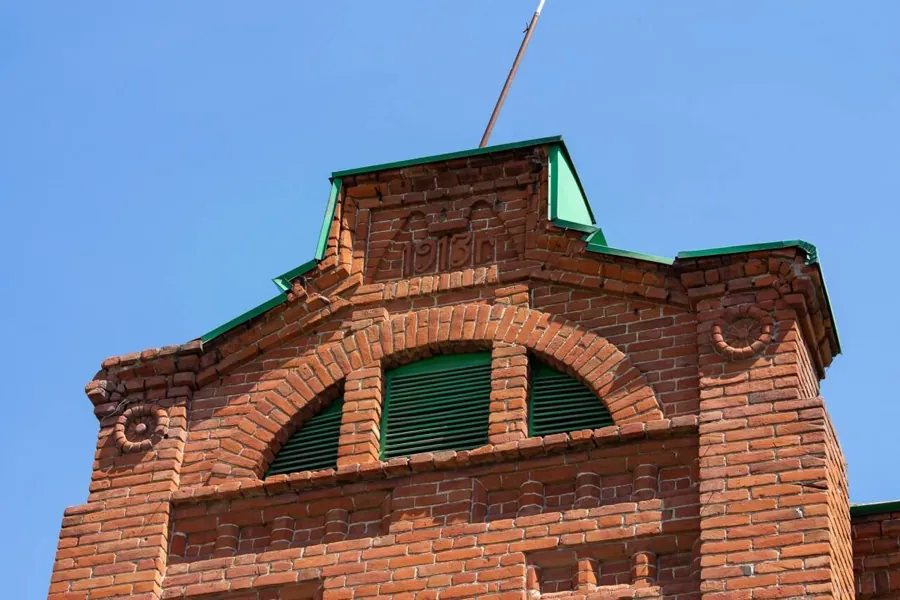
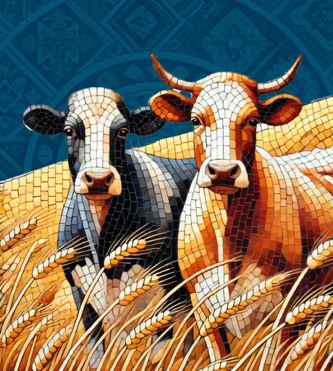
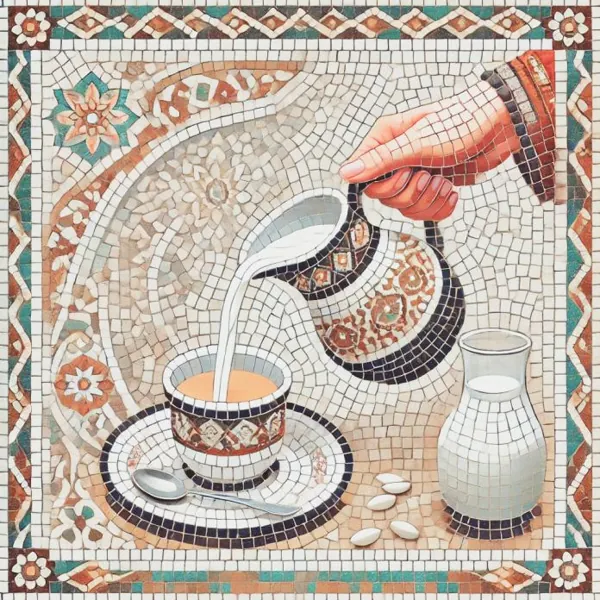
Kostanay is known for its red-brick houses: residents take good care of them, just as the company preserves its traditional recipes. Handmade mosaics and sgraffito still live on the façades. We use mosaic to convey continuity between generations.
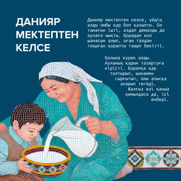
The visuals are built on scenes with people and milk assembled from mosaic. It emphasises the craft of a natural product and the longevity of the recipes, without old photographs and documents.
Colour and type
- Brick burgundy
#6A2F11the colour of Kostanay's architectural landmarks, a link to heritage - Warm ginger
#D6531Dcosiness, the warmth of the sun, regional character - Green
#0F4D2Dnaturalness and organic feed for the cows - Blue
#034568the sky; echoes the packaging colour without copying it
- Proxima Nova Boldheadings, in capitals
- Ubuntu Monobody text
Solution
- 01
We studied the city: the red-brick architecture, the mosaics and sgraffito on the façades
- 02
We built a palette from the colours of Kostanay: brick burgundy, warm ginger, green and blue
- 03
We chose a font pairing: Proxima Nova for headings and Ubuntu Mono for text
- 04
We created a mosaic imagery: people, cows and milk assembled from smalt
- 05
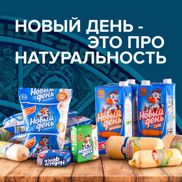
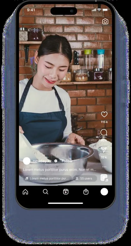
We developed post and story templates for social media
Result
- What we handed over to the brandthe visual concept: colours, fonts, mosaic imagery, post and story templates
What worked
- Grounded in Kostanay's real urban code rather than the abstract “rustic” aesthetic typical of dairy brands.
- Mosaic as a single technique: it works equally well in portraits, product and holiday scenes.
- The audience's heroines were built into the imagery from the start, so the style speaks to specific people.
Team
- Inna KupermanBrand strategist
- Daria KrasnovaEditor
- Maxim FetisovContent strategist
- Ekaterina LoganovaArt director
Request
Tell us about your task
We will suggest an approach and a format of cooperation.